A calendar is one of the least forgiving things to print. It is dated, it is distributed on a schedule, and it is produced in quantity, so a small error is not a small error once it is multiplied across a thousand copies. The good news is that almost every expensive calendar mistake is predictable, and each one has a concrete fix you can settle before the file ever goes to press. Here are the six that cause the most reprints, and the specifications and timing that keep you out of trouble.
Approving the file without checking the date grid
The single most expensive mistake is skipping a real proof. On a calendar, the proof is not just about color and layout; it is about the dates themselves. Weekday alignment, leap years, the day a month starts on, and the placement of holidays are all easy to get wrong and impossible to see at a glance. Confirm the starting month, verify that the grid matches the correct year, and check that any holidays you have marked are accurate for the region you are distributing in. A calendar that starts the week on Monday reads very differently from one that starts on Sunday, and a promotional calendar with a holiday on the wrong date undermines the professionalism it was meant to project. Read the printed or PDF proof against an authoritative reference, not against your memory.
Sending photos that are too low-resolution
Artwork needs to be at least 300 dpi at the final printed size, and that requirement scales with the calendar. An image that looks crisp on a phone can print soft or pixelated once it is enlarged to fill a wall page. The math is simple: multiply the print dimension in inches by 300 to get the pixels you need. A standard 8.5 by 11 inch page wants about 2,550 by 3,300 pixels, while an 11 by 17 inch wall page wants roughly 3,300 by 5,100. Poster-format calendars push the requirement dramatically higher.
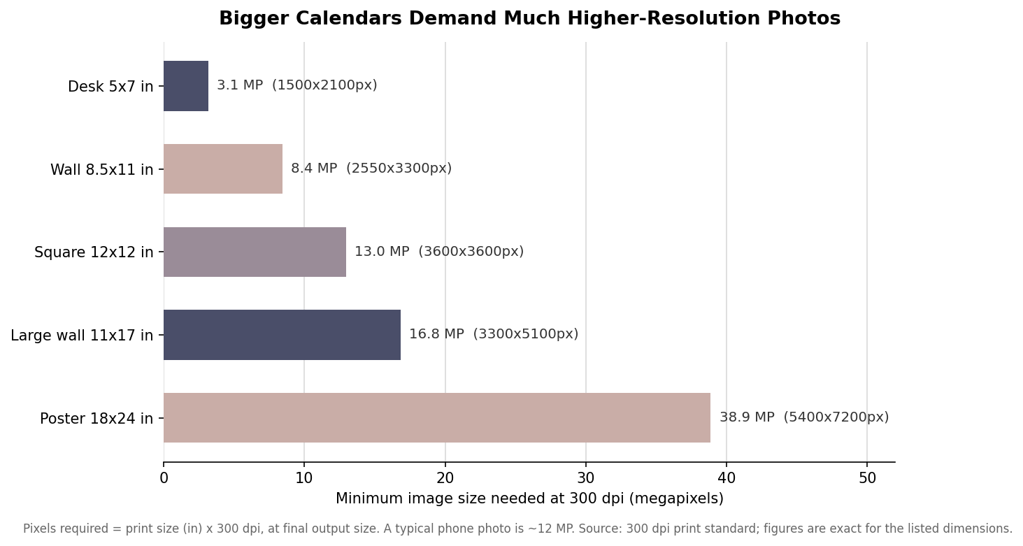
The practical takeaway is that a casual snapshot is fine for a small desk calendar and risky for a large wall or poster format. When a client supplies images, ask for the original files rather than versions pulled from a website or a messaging app, both of which strip resolution. And remember that upscaling a small file in software does not add real detail; it only invents pixels and often makes the softness worse.
Underspeccing the paper
Lightweight stock is the fastest way to make a calendar feel cheap. Calendar pages are typically printed on text weights in the range of 80 to 100 lb, heavy enough to hang flat and resist show-through from the printing on the reverse. The cover, if the format has one, is usually a heavier cover stock so the whole piece holds its shape on a wall or a stand. Finish matters too: a gloss coat makes photography pop but can fight with pen ink, while a matte or satin finish is easier to write on, which is the whole point of a calendar people actually use. Decide the paper and finish deliberately rather than accepting a default, because it is the first thing a recipient feels.
Designing to the trim line instead of the bleed
Any color or image that runs to the edge must extend past the trim, or you risk a thin white sliver when the cutter drifts even slightly. The standard is a 0.125 inch (one-eighth inch) bleed on every side, with important text and logos kept at least 0.25 inch inside the trim so nothing critical lands in the cut zone. Calendars add a specific wrinkle that flat prints do not have: the binding edge and the hanging hole. Leave clearance at the top for the coil, wire, or saddle stitch and for the punched hole, so a date number or a face does not get swallowed by the binding. Confirm where the hole punches before you finalize the layout, not after.
Ordering the wrong quantity or the wrong year
Quantity errors cut both ways. Order too few and you are short in the middle of a distribution you cannot easily top up, because a second short run rarely matches the unit economics of the first. Order too many and you are storing and eventually recycling dated stock that becomes worthless the moment the year turns. Base the number on a real distribution plan, count the channels the calendars will actually go through, and add a modest overage for damage and latecomers rather than a large speculative buffer. And state the year explicitly in the order and on the proof; it sounds obvious, but a calendar built from last year’s template with the dates rolled forward incorrectly is a classic and painful error.
Starting too late
A calendar has a hard deadline that a brochure does not. A calendar delivered in the second week of January has lost much of its value, so the production runway has to be planned backward from the date you need copies in hand. As a rule of thumb, allow time to finalize artwork and approve the mockup, about 2 weeks for production once it is approved, and time for shipping. For a January in-hand date, that means getting artwork approved in November rather than December.
The runway is indicative rather than fixed; a smaller run at a fast printer can move quicker, and a large or complex job with multiple approvals can take longer. Whatever the exact numbers, the discipline is the same: work back from the delivery date, build in a buffer for a revised proof, and treat the artwork deadline as immovable. Calendars reward planning more than almost any other printed product, and every one of these six mistakes disappears when the decisions about dates, resolution, paper, bleed, quantity, and timing are made on purpose instead of by default.